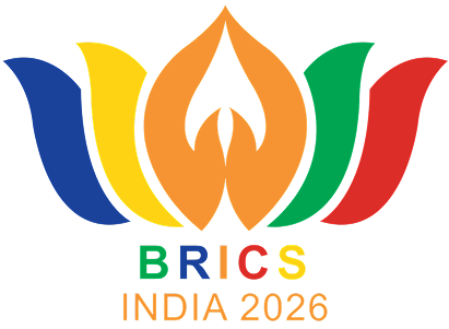
By becoming the chairman country of the BRICS on 1 January 2026, India, besides announcing a new theme, revealed a logo having a profound cultural and philosophical significance. The official BRICS 2026 logo is a flowering lotus with the hand gesture depicting a very respectful and gracious greeting, i.e. the fold of one’s palms (Namaste) in the centre, the whole thing being encircled by the colours representing all ten member nations.
This is not just a beautiful design. The lotus and Namaste together strongly convey that India wants BRICS 2026 to be an open, respectful and civilised group based on values rather than being purely a set of negotiating geopolitical partners. Since the world is looking at an expanded BRICS that is able to cope with very complicated global problems, the symbolism selected by India gives very important hints about the way Delhi plans to influence the group during its fourth chairmanship.
The Lotus: A Picture of Resilience and Purity
The lotus has been a holy sign in Indian culture for millennia. It is a plant that thrives in the mud while staying clean and beautiful. This is a strong symbol of being able to withstand hardships. As India’s BRICS 2026 theme is “Building for Resilience, Innovation, Cooperation and Sustainability”, the lotus is a great representation of the first pillar: Resilience.
In a world where we are constantly made aware of economic problems, political tensions, climate changes, and technology transformations, the lotus is a symbol of how various nations – especially those in developing countries – can overcome hardships and still keep their uniqueness and values. By featuring the lotus prominently on the logo, India is giving a gentle reminder to the BRICS members that real power comes from one’s internal resilience and a harmonious relationship with nature, not simply from economic or military might.
Namaste: A gesture of equality and respect
The Namaste gesture, palms brought together are among the most iconic Indian cultural symbols. It means “I bow to the divine in you” and has been traditionally used as a greeting as well as a sign of respect. In the BRICS 2026 logo, the Namaste is combined with the lotus, a metaphor that cooperation in the group should rest on mutual respect and equality rather than the dominance of any one power.
This is a major decision. For instance, India positions BRICS as a club of equals in contrast to other multilateral forums where power imbalances are often quite visible. The Namaste gesture is a symbol of “Humanity First” a phrase that Prime Minister Narendra Modi has referred to at length, and it conveys that India wishes BRICS to concentrate on human development and not be another stage for great-power competition.
Colours Symbolising Unity in Diversity
The colours used in the logo originate from the national flags of all the present BRICS members: Brazil, Russia, India, China, South Africa, Egypt, Ethiopia, Iran, Saudi Arabia, UAE, and Indonesia. This intentional selection portrays India’s idea of unity in diversity. It recognises that although the member countries are very diverse in terms of their civilizational, political, and economic aspects, they collectively yearn for a more fair global order.
The multicoloured lotus is a graphical way of telling that BRICS is no longer simply a club of five nations. After its expansion in 2024, the grouping now covers a much larger part of the world’s population and economy. The logo not only acknowledges this diversity but also highlights the power of unity.
Connecting Symbolism to the Four Pillars
India’s four pillars of BRICS 2026 Chairship Resilience, Innovation, Cooperation, and Sustainability are not just intangible ideas. They are strongly linked with the logo’s symbolism –
Resilience
A lotus flower that grows and blooms in muddy waters
Innovation
The drive and ingenuity to create solutions for contemporary issues
Cooperation
The gesture of Namaste, expressing mutual respect
Sustainability
Being eco-friendly and maintaining balance with nature, just like the lotus
Through these symbolisms in a culturally grounded visual identity, India is working towards making BRICS more understandable, appealing and touching, to the extent that even ordinary people of member countries who are not very much into diplomatic talks can relate to it.
A Shift from Traditional Multilateralism
The selection of such a culturally rich logo is not a mere decorative decision, but rather a subtle though significant change of how India is viewing multilateral platforms. While the logos of many international bodies feature abstract geometric patterns, India has intentionally gone back to its civilizational roots.
This strategy is very much in tune with India’s foreign policy at large which highlights “civilizational diplomacy” – showcasing ancient wisdom as a source of solutions for the present-day global issues. Additionally, it sets BRICS 2026 apart from the previous chairmanships. In the past, when other countries took the lead, they gave major weight to economic and security aspects of cooperation.
However, India seems, through this cultural and human element, to be adding a dimension that makes not only the BRICS space but also the individual member states to feel less like a strict alliance and more like a family of nations working together for shared objectives.
Global Context and Reception
Overall, the logo and the philosophy guiding it have received warm words. An array of countries from the Global South have welcomed India’s move to transition away from the Western-style institutional language and also add layers of respect, sustainability, and inner strength to the new language. However, symbolising through logo cannot really overcome the profound geopolitical divergences within BRICS, in particular, the India-China discord or the issues concerning Iran and Russia, according to some analysts.
Even so, the logo has been effective in generating debate on what kind of BRICS the world is expecting in 2026 – just an economic bloc, a geopolitical counterweight, or a forum for cooperative discussions on the matters which concern developing nations.
Looking Ahead
Since India is the BRICS Chair till 2026, the lotus and Namaste will, without a doubt, be the ever-present visual elements symbolising the core message of the Chairship; i.e. global problems are collectively solved through wisdom, respect for each other, and a human bond that is hand-in-hand with resilience.
It is possible that the effect of this symbol will be more than just nice to the eyes and a source of inspiration, and that it may even lead to substantial results at the Leaders’ Summit later this year. At any rate, by selecting a logo that appeals to both emotions and intellect, India has already demonstrated a characteristic and unique style for its presidency, which not only seeks to make BRICS a more powerful group, but also one that is more humane and inclusive.
In today’s divided world, where people are still looking for new ways to cooperate, the BRICS 2026 logo, a lotus offering Namaste, has a simple and profound message that quietly and hopefully depicts a future for the Global South.